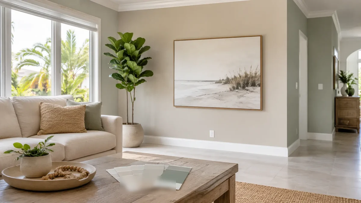
Start With the Light in Your Home
South Florida homes get some of the brightest, warmest natural light in the country, and that light changes how every color looks once it is on the wall. A soft gray that looks perfectly neutral on the swatch can turn cool and blue in a sun-filled room, or a warm beige can look almost yellow by late afternoon.
Before you fall in love with a color on a small chip, think about which direction your main rooms face and how much light they get. North-facing rooms get cooler, more even light and can handle warmer colors that might feel too heavy elsewhere. South and west-facing rooms get intense, warm light for much of the day, which tends to wash colors out and make them read lighter than expected. The same color can look like two different shades in two rooms of the same house. The same light principle applies outside too, which we cover in our guide to choosing exterior paint colors for a South Florida home.
Lean Into Soft, Livable Neutrals
The colors that tend to work best in South Florida interiors are soft, warm neutrals: warm whites, greiges, sandy beiges, and muted coastal tones like soft sage and pale blue-green. These colors do three things well. They hold up under bright light without feeling stark, they pair naturally with the tile and stone finishes common in homes here, and they create a calm, open feeling that suits the indoor-outdoor lifestyle most people want.
That does not mean everything has to be beige. Deeper and bolder colors can be beautiful as accents, on a single feature wall, in a study, or in a powder room where a little drama works. But for the main living spaces that flow together, softer neutrals give you the most flexibility and the longest-lasting appeal. Trendy colors date quickly. A well-chosen neutral does not.
Think About Flow Between Rooms
Most South Florida homes have open floor plans where the living room, kitchen, and dining area all see each other. That means you cannot choose colors room by room in isolation. The colors need to work together as you move through the space.
A common approach is to choose one main wall color for the connected living areas, then use variations of that same tone, slightly lighter or slightly deeper, in adjoining rooms to create subtle definition without hard breaks. Bedrooms and offices, which are usually more separate, give you more freedom to go a different direction. If you are planning a whole-home repaint, mapping the flow before you buy paint saves a lot of second-guessing later. Our interior painting cost guide for Palm Beach County covers how a whole-home project is typically planned and priced.
Do Not Forget the Trim, Doors, and Ceilings
Wall color gets all the attention, but the trim, doors, baseboards, and ceilings are just as important to how a room feels. Most South Florida interiors use a clean white or soft white on the trim and ceilings, which frames the wall color and makes the architecture stand out.
The contrast between wall and trim matters. Too little contrast and the room can feel flat. Too much and it can feel busy or chopped up. A soft white trim against a warm greige wall is a combination that works in a huge range of South Florida homes because it feels crisp without being harsh. If your home has crown molding, tray ceilings, or other architectural details, the right trim color is what makes them read as features instead of disappearing.
Choose the Right Sheen for Each Room
Color is only part of the decision. The sheen, or how much the finish reflects light, matters just as much, especially in a humid climate.
For most interior walls, an eggshell or satin finish is the standard in South Florida homes. It resists moisture better than flat paint and is easy to wipe clean, which matters in a climate with year-round humidity. Flat finishes hide wall imperfections nicely but are harder to keep clean, so they are usually reserved for ceilings and low-traffic rooms. Trim, doors, and cabinets are typically done in a semi-gloss or gloss for durability and easy cleaning. Matching the sheen to how each room is used is part of getting a result that both looks right and holds up, and it is one of the things we walk through on every interior painting project.
Always Test Before You Commit
This is the single most important step, and the one most people skip. A color chip under store lighting tells you almost nothing about how that color will look on your actual walls in your actual light.
Buy sample sizes of your top two or three colors and paint large swatches directly on the wall, at least two coats, ideally on more than one wall in the room. Live with them for a few days. Look at them in the morning, at midday, and in the evening, and with both the natural light and your indoor lighting on. Colors shift dramatically depending on the light source and the other colors and finishes in the room. A color that looks perfect on one wall can look completely different across the room. Taking a few days to test before committing to a whole-home color is what separates a result you love from one you settle for.